


The short version
- 01
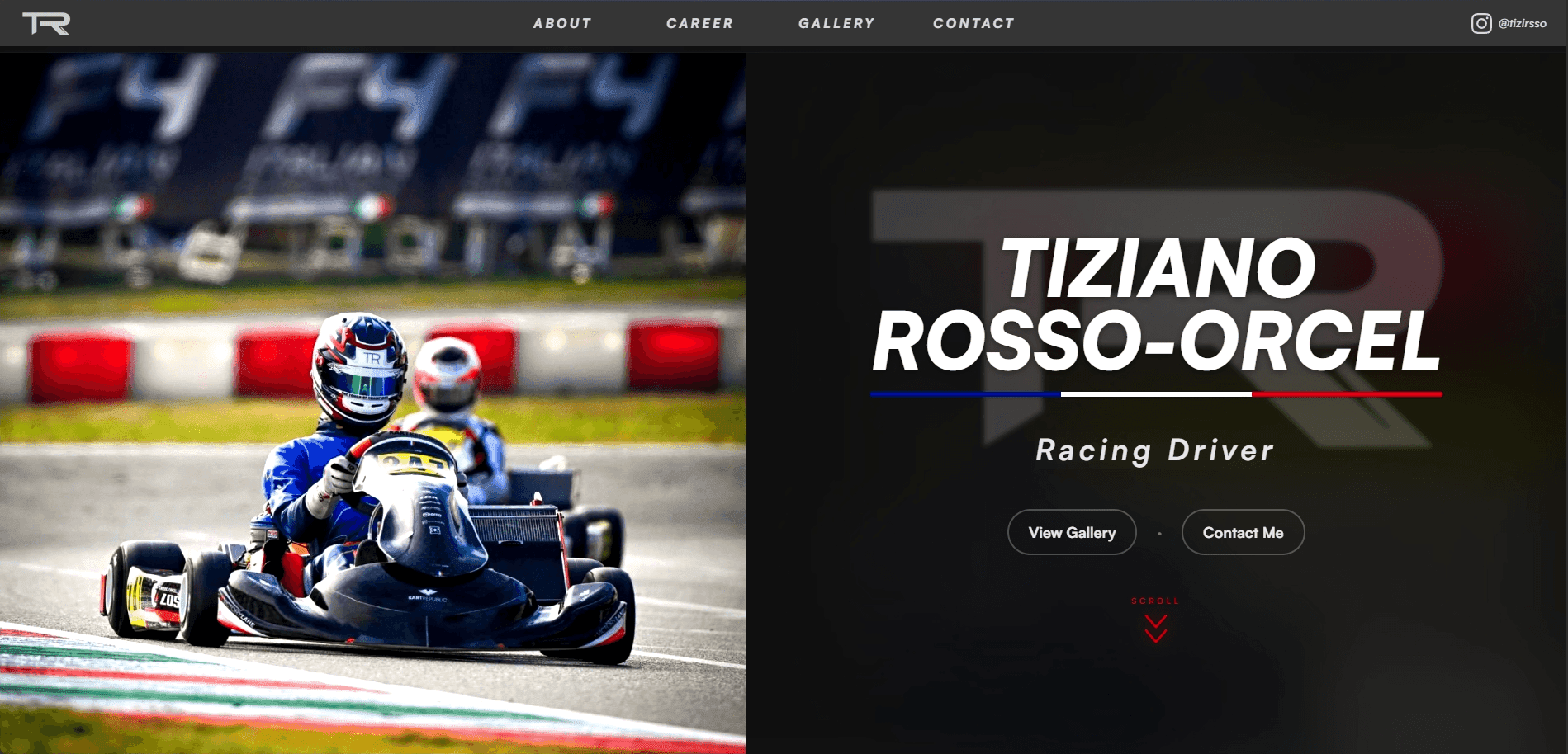
This project started when a friend connected me with a professional karting driver who needed a stronger web presence for the next stage of his racing career.
- 02
We started pretty broadly. I learned what he wanted the site to accomplish, looked through racing sites and visual references with him, and worked back and forth through logo ideas, colors, and the overall tone before getting too deep into the build.
- 03
I used AI-generated references during the early exploration phase, then rebuilt and refined the actual logo and interface direction myself in Figma. From there I put a working skeleton online, shared different versions directly through the site, and kept tightening the design until we had a V1 we both felt represented him well.
The problem
The driver had photos, results, history, and a real story, but there was no single place that organized all of it into something he could confidently send to a sponsor or new connection.
The site needed to feel like motorsport without looking like a generic racing template covered in speed lines, oversized statistics, and effects that competed with the actual content.
What I built
- Logo and visual direction
- Responsive website design and development
- Driver story and racing history structure
- Achievements and results sections
- Photo and media presentation
- Sponsor-facing partnership content
- Contact flow, deployment, and continued hosting
Design decisions
I let the racing photography create most of the energy and kept the surrounding interface controlled. The site still feels bold, but the layout gives the driver's story room to breathe.
Instead of treating the project like one final mockup, I shared working versions online. That made feedback much more practical because the client could react to the real page instead of imagining how a static frame might feel once built.
Technical decisions
I built the site with Next.js and Tailwind CSS so I could move quickly between design and implementation while keeping the layout responsive and reusable.
Framer Motion was used selectively for movement without turning the site into an animation demo, and Vercel kept deployment and later updates simple.
Challenges
The main challenge was translating broad inspiration into a direction that felt personal to the driver instead of copying the visual language of another racing site.
There was also a lot of content to organize, so I had to keep asking what a sponsor or new visitor actually needed to understand first.
The outcome
We launched a complete first version that gives the driver one professional place to share his background, achievements, media, and sponsorship value.
I have continued handling the hosting and maintenance, so the engagement carried on past launch into ongoing support rather than ending at handoff.
What I'd improve next
I would eventually add a lightweight content system for race updates, results, and new media so the client can keep the site current throughout a season without needing a code change each time.

Let's Talk
Want something like this for your business?
Whether it's a website, a system, or an idea that still feels a little messy, I can help you figure out what makes sense next.